I will piss off a few purists here, but if you think you’re performing business intelligence by producing and checking simple text/numbers reports, you’re deluding yourself. It’s a decision system support, no doubt, and it may be data-based. Yet, perusing a bunch of separate and disparate reports to take decisions, is like trying to visualise the complete image of a puzzle by looking at its pieces. Besides, it is close to impossible to correlate tabular data by observing it only. Should I also mention the time and effort it requires to prepare and deliver periodic sets of reports? Even if automated, the process usually is cumbersome, and the results are as per above: no way to see the big picture, no correlation possible.
I’m not going to waste your time listing more reporting’s shortcomings, so let’s move onto the dashboard advantages:
- A dashboard is cheap and requires little o no maintenance, so each company’s department can have its own.
- Data is shown dynamically, which means it can even be analysed in real time. RT would be hardly useful in the travel industry, except for large OTAs and hotel chains, airlines and bed banks. However, fresh datasets (updated every few hours, for instance) can be consumed from a dashboard anytime on any device.
- Reports usually provide historic information (the past), while dashboards can display predictions and what-if simulations in an interactive way, for example by filtering dates, products, competitors, etc.
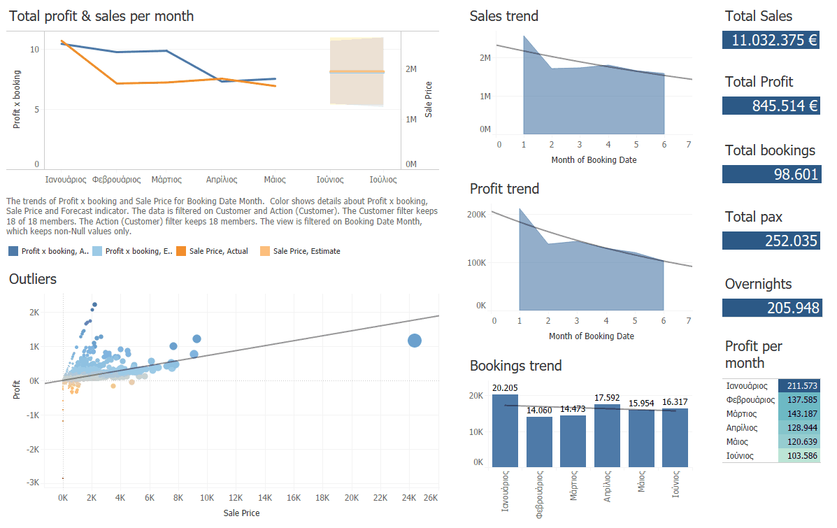
- To correlate information into images, provides useful insights, rather than hints that must be processed by intuition. See image below: if you had to study two different reports row by row, how could you discover “outliers” like the one clearly appearing on the left hand corner? In a graphic like this, you’ll spot strange occurrences at once, not wasting time before investigating.

I could go on and on, but I guess you’ve got the idea by now. Even if you’re able to see the puzzle’s “big picture” through reports, it will never be more than a static picture, like a movie poster. A set of dashboards, instead, would be like watching the whole movie. BI is, by its crudest definition, a way to profit from insights. Which one do you think is more profitable: a photo coloured by data, or a movie that tells a story through data?
Simply put, no dashboards, no BI. End of story.
Thanks for reading!
Marcello Bresin